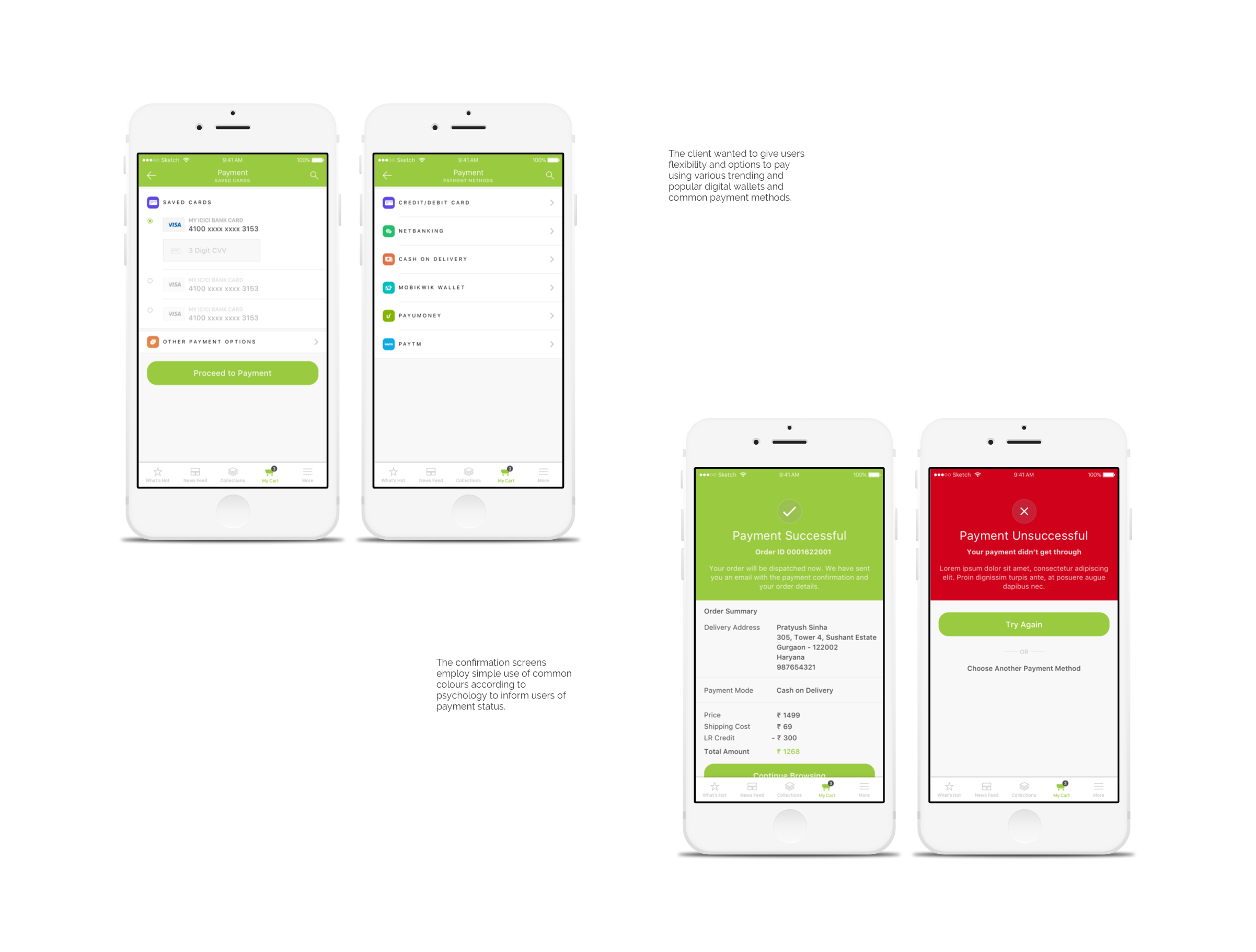
DESIGN BRIEF: The client wanted to restructure the app and architecture as they presented research and facts stating how users were not interacting much with a lot of features in their app. Over time, they had introduced new features which led to over cluttering the app with much information which became overwhelming to users.
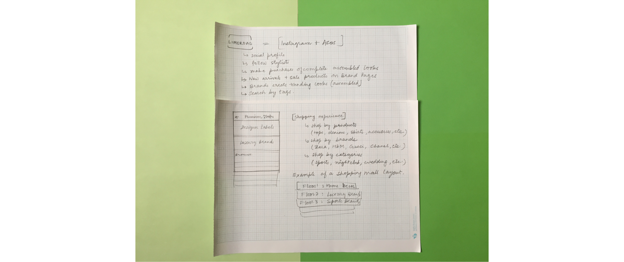
TARGET AUDIENCE: Limeroad is a platform which offers not just fashion shopping but it allows users to purchase complete looks - tops, jeans, skirts, dresses with accessories that go with it and shoes. Hence, it attracts a lot of college students and young married women. One can look for celebrity fashion and actually buy cheaper options that resemble those looks.
UX CHALLENGE: Limeroad is a social and fashion shopping platform. There are fashion bloggers, curators and users along with fashion designers and brands. Now anyone and everyone can create a ‘look’ on the platform and hence credibility becomes an issue.
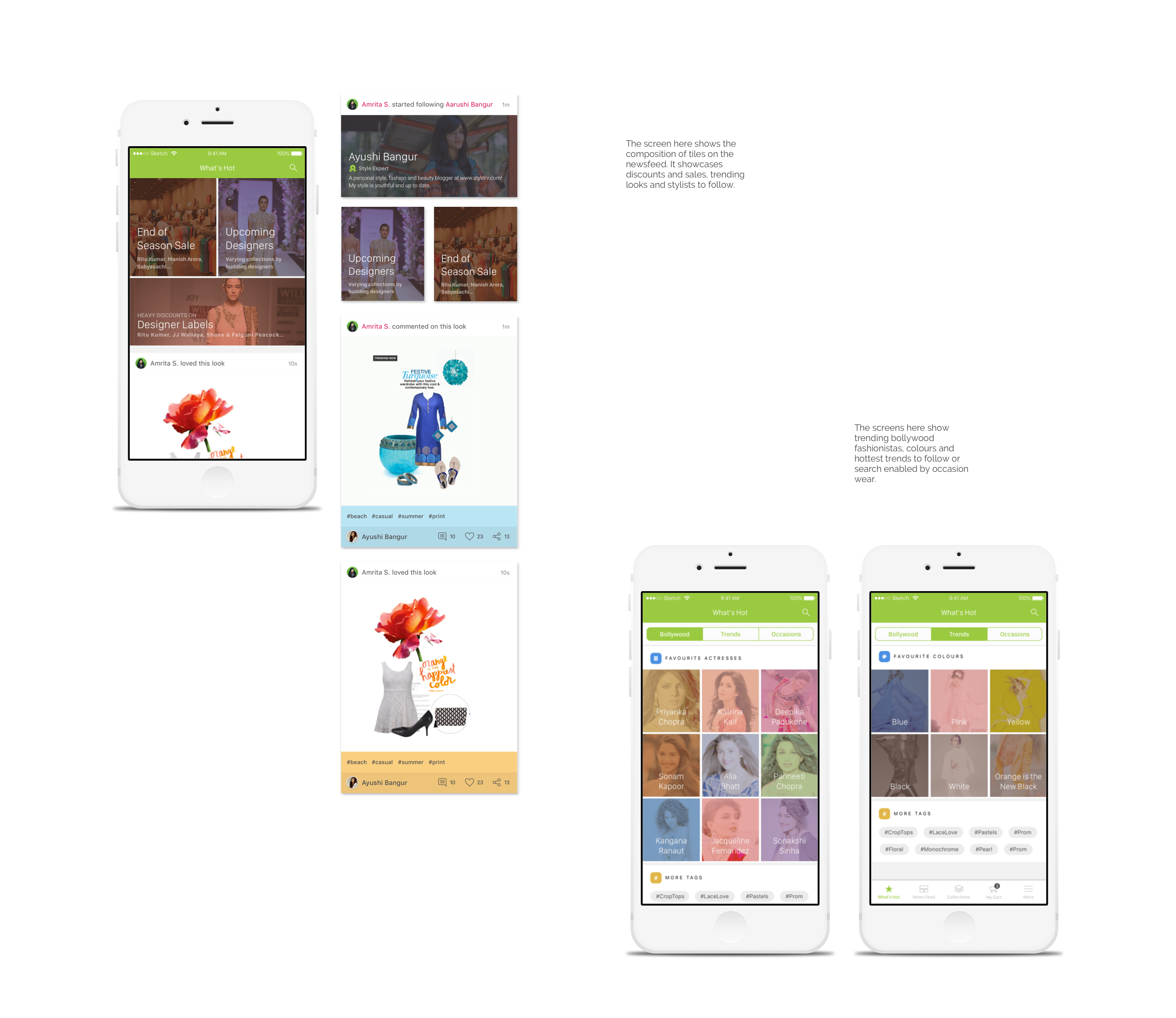
Secondly, an existing user sees activity from their social circle but even a new user is shown activity of popular fashion bloggers and curators. It is confusing for users to understand why they’re seeing a certain post.
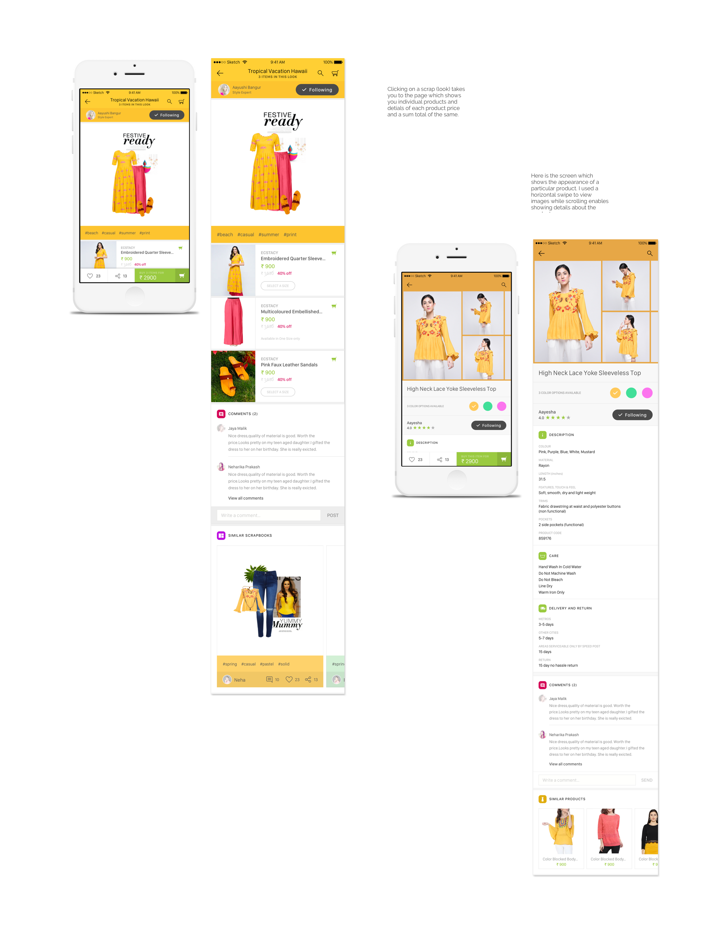
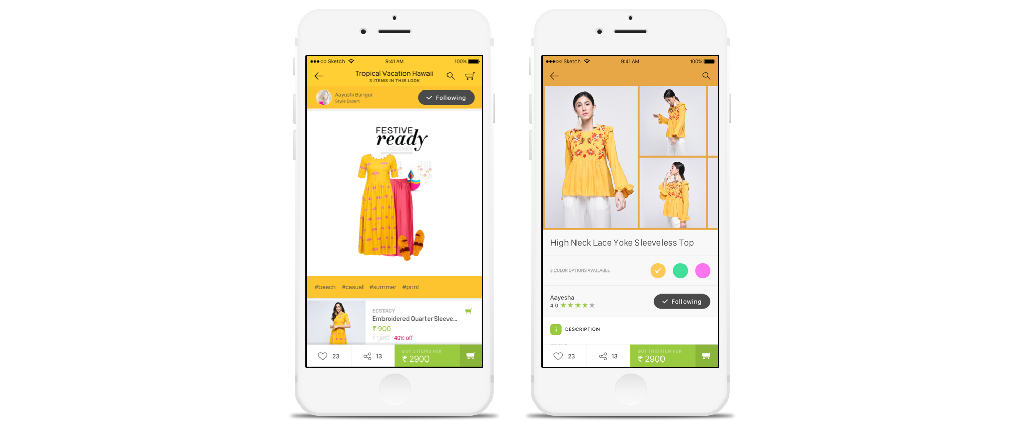
Hence, the challenge was on many levels. One was to build a smooth architecture and map the flows. Secondly, the UX and UI had to work together to create visible differentiation between appearance of products, looks (scraps), and stories on the platform.
I started off by mapping the app and its contents to establish an understanding. Simultaneously, I was also working on creating understandable differences between various elements on the app.
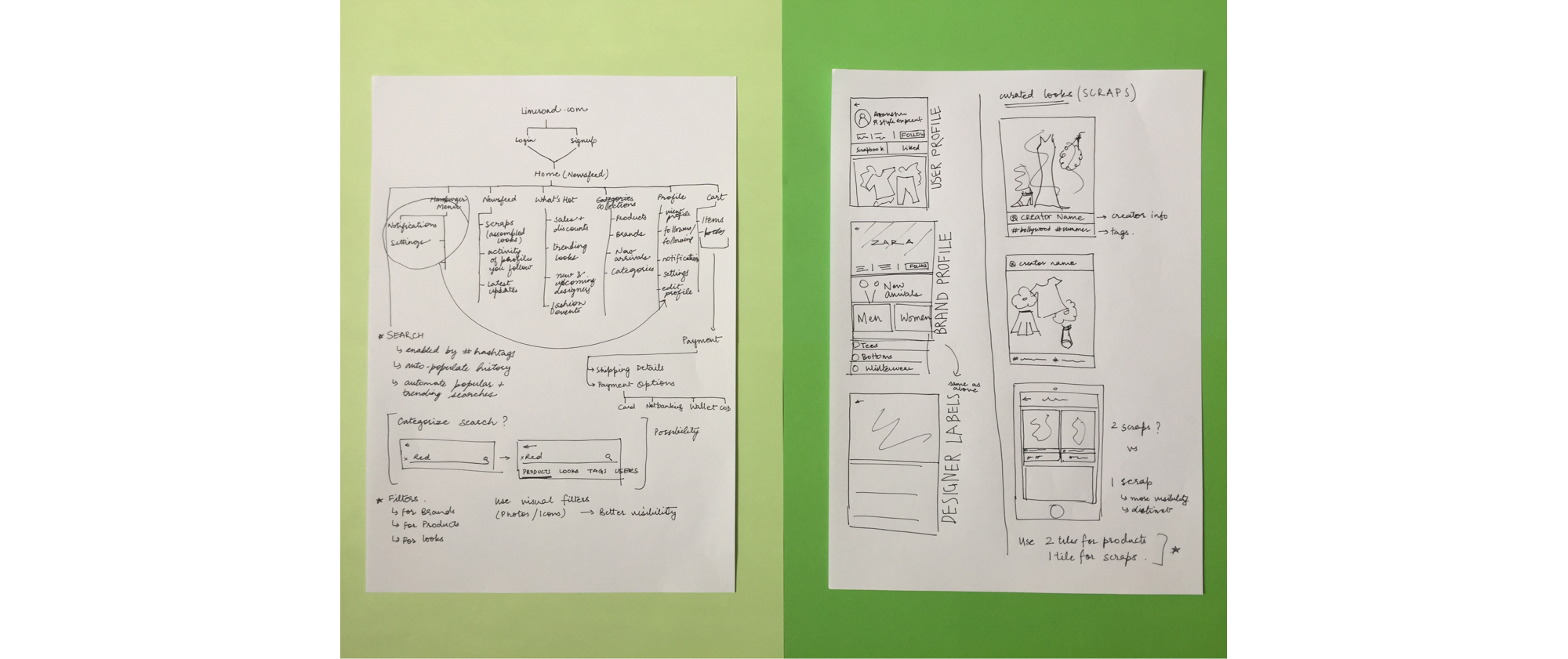
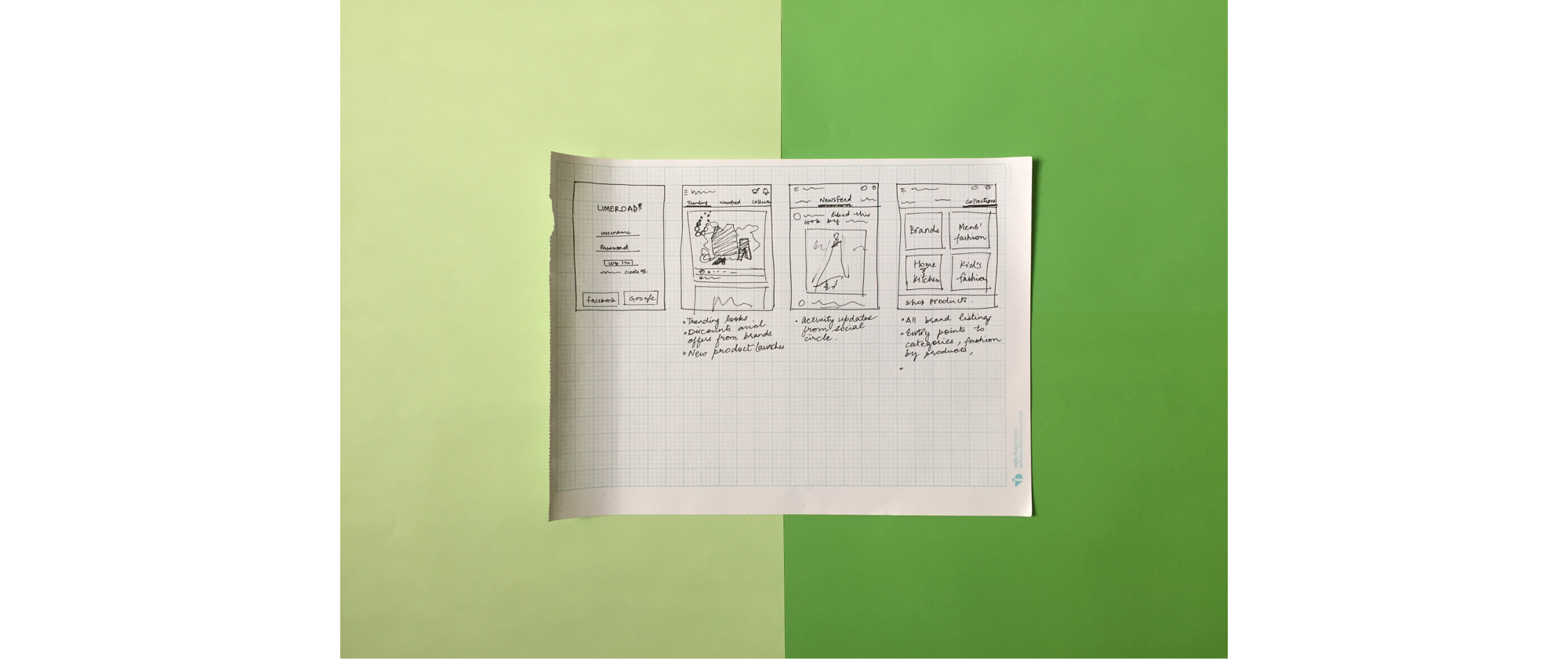
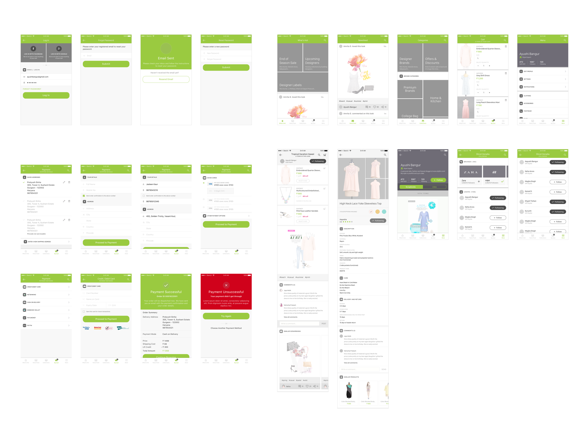
After careful study of the platform and creating user flows, I moved on to creating digital wireframes. Presented below are the final high fidelity wireframes.